
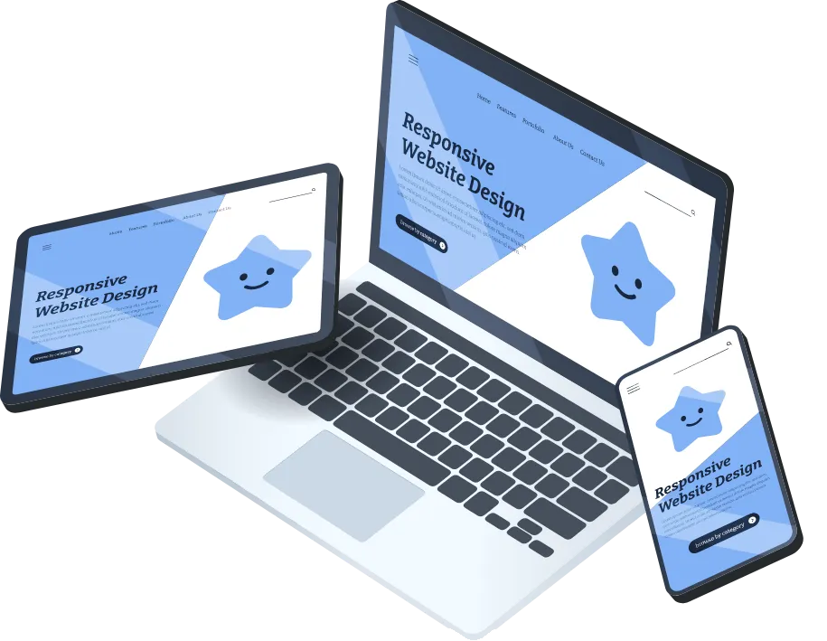
Responsive Mobile Design
Your Website Is Failing on Mobile?
Does your site look fine on desktop but fall apart on a phone? Slow load times, clunky menus, and hard-to-read text drive mobile users away, and they don’t come back. With more than half your traffic coming from mobile, that’s a costly problem.
At Living Light Digital, we design mobile-first websites that adapt seamlessly to any device and keep your visitors engaged.

your website outdated, or doesn’t bring results?
At Living Light Digital, we design modern, purpose-driven websites that attract the right people, build trust, and help your vision shine online.
Our Story
We are passionate web artisans, committed to creating visually stunning and functional websites that captivate audiences and elevate businesses to new heights.
RESPONSIVE MOBILE DESIGN
Why Responsive Design Matters
Over 60% of people browse the web on their phones. If your website isn’t built for mobile, you’re losing leads before they even see what you offer. Pinch-and-zoom frustration, broken layouts, and lagging load times kill trust and conversions.
Your website should work everywhere—from a 6-inch phone to a 60-inch monitor.

How We Help
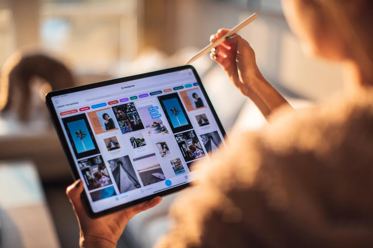
We don’t just shrink your desktop site to fit on a phone. We design with a mobile-first strategy that prioritizes the experience of your on-the-go audience. That means creating layouts that are easy to navigate with one hand, buttons that are effortless to tap, and pages that load quickly, even on slower connections.
Our focus is on usability and performance. By combining clean design with speed optimization and thorough device testing, we make sure your website feels modern, professional, and frustration-free. The end result? Visitors who stay longer, engage more, and are far more likely to convert into paying customers.
Our Approach
We start with a mobile-first mindset. Instead of designing for desktop and hoping it translates, we build for the small screen first and scale up. That means layouts that are clean, navigation that’s intuitive, and buttons that are actually tap-friendly.
We also optimize for speed and performance. Every site is tested across devices and browsers so your brand looks sharp and functions flawlessly no matter how customers find you.


What You Get with Living Light Digital
With Living Light Digital, you get more than a simple redesign. You get a website built to perform. Every layout is designed mobile-first, adapting seamlessly to any screen size so your site looks sharp and professional everywhere. Menus, buttons, and calls-to-action are crafted to be tap-friendly, making it easy for visitors to engage on the go.
We optimize for speed to ensure faster load times and a smooth browsing experience, while thorough cross-browser and cross-device testing guarantees consistency no matter how your audience finds you. The result is a seamless experience that keeps visitors connected to your brand and drives more conversions.

The Living Light Digital Difference
Most agencies design for desktop and cross their fingers it works on mobile. That leaves visitors pinching, zooming, and bouncing. We do the opposite, starting with mobile so your site works everywhere without compromise.
Customers get a smooth, frustration-free experience, and you get a website that builds trust and drives more conversions.


Ready to Go Mobile-First?
Don’t let mobile traffic slip through the cracks. Let’s make your website as agile as your business.
Book a free 30-minute Discovery Call today and see how responsive design can boost your engagement and conversions.
FREQUENTLY ASKED QUESTIONS
1. What does “responsive mobile design” actually mean?
Responsive design ensures your website automatically adapts to any screen size, whether desktop, tablet, or phone, without users needing to pinch, zoom, or scroll awkwardly.
2. Why is mobile-first design so important?
More than 60% of all web traffic now comes from mobile devices. If your site does not work seamlessly on mobile, you risk losing potential customers before they ever see your message.
3. Will my existing website work on mobile if I do not redesign it?
Most older sites may technically load on mobile, but they are not optimized. That means slower performance, poor layouts, and frustrated users, which often leads to higher bounce rates.
4. How does responsive design impact SEO?
Google prioritizes mobile-friendly sites in search rankings. A responsive design improves user experience and also helps you rank higher to attract more organic traffic.
5. What is included in your mobile design process?
We focus on mobile-first layouts, tap-friendly menus, optimized images, faster load speeds, and testing across multiple devices and browsers to ensure a flawless experience.
6. Will my website still look good on desktop if it is designed mobile-first?
Yes. Mobile-first does not mean mobile-only. We start with the smallest screens to make sure everything works smoothly, then scale up to create a consistent experience across desktops and larger screens.
OUR MISSION
Living Light Digital exists to illuminate ideas and empower people through thoughtful web design, helping every client share their story, grow their impact, and shine brighter in the digital world.